Let's kill zoom calls : HfG's workshop, 21-22 November 2022, Schwäbisch Gmünd (GE)
Florian Geiselhart, a computer scientist and former temporary professor at HfG, played a significant role during the pandemic by creating hfg.design 1.0, a teaching platform. Currently, he is actively working on the development of the 2.0 version. Florian not only provides technical guidance to students but also offers design support throughout their projects.
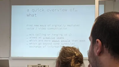
A quick overview of...
Florian discussed the tools we utilize for remote collaboration, highlighting that most collaborative tools are designed for productivity rather than creative work. We cannot deny the limitations of platforms like Zoom when it comes to fostering true creative engagement. We can't argue on Zoom.
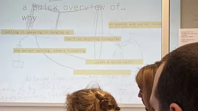
We collected several thoughts regarding Zoom:
- Communication is constantly active on Zoom, not on-off.
- It enables us to be together despite physical separation.
- What about non-verbal communication when we are not speaking?
- Many conversations often happen simultaneously.
- How can we share emotions and atmosphere, not just information?
Following that, we played a game to break the ice: Two truths and a lie.
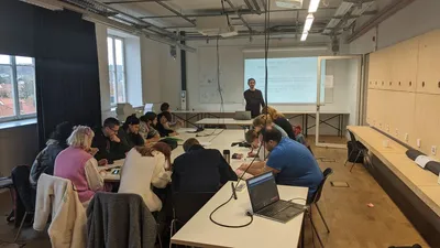
Making teams
Each student wrote down their thoughts on a piece of paper regarding the various topics related to video calls discussed during the initial days. Here is an excerpt of the ideas compiled:
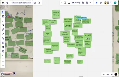
- You can do your own break when working remotely.
- You can't really assess how other person feels.
- Non-verbal clues are important.
- Feelings of closeness or distance to others depending on their location in the room is absent via Zoom.
- Legs are hidden.
- "Synchronization" between people when someone is talking, is easier to avoid speaking at the same time.
- How to have a view on work progress of others?
- Physical touch is missing.
- Getting up to stick the post-it notes to an absent wall.
- The truth/lie game wouldn't be so funny on Zoom.
- Small chats in between meetings.
- Smell of a room.
- Sitting together.
- Side-talks.
- Seeing the emotions (gestures/mimics) of other participants that are not talking.
- Rudimentary extra-class interactions.
- Breaks (all at the same place) are missing.
- Everyone would talk to each other's after a IRL meeting, not as a whole group.
- Natural group-building.
- Small talk.
- Chilled atmosphere.
- Eye contact.
- Direct feedback because everyone is muted.
- Work/life balance.
- Being in the same environment/experience the same environment as the others.
After collecting our ideas, we formed the groups by deliberately mixing the students, primarily based on their areas of interest as much as possible.
Teamwork
After first day ended, the rest of the week was dedicated to work on teams' projects that were presented at the end of the international workshop week in HfG.
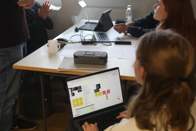
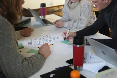
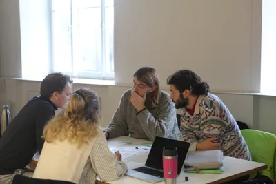
Projects made by students
Echo
Maëlys Bard, Alféa Morelli, Lars Dörper, Maximilian Becht
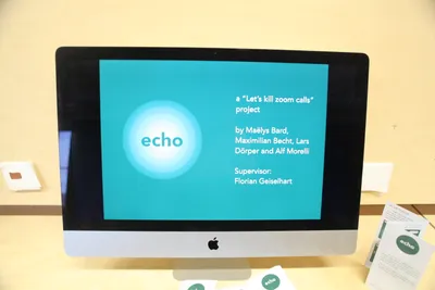
echo is a 2D virtual environment that allows users to move around in a video-call space. We focused on the spatial and sonic aspect of group work by imagining that it would be possible to move closer to the people you want to listen to and further away from others rather than mutating to simulate the sensation of sharing a space with other people. In echo, users can interact with each other in many ways such as sharing a presentation, activating magnetism to automatically follow the person as they move, or teleport to each other. The idea of this project is to get away from the strict and static aspect of the grid
Who is this tool for?
Our software can be used by creative teams that need to work remotely, by groups of friends or by companies, mostly large groups.
What type of collaboration is it for (sychroneous/asynchroneous, collaborative/cooperative/participative)?
On echo, you can work alone while maintaining direct contact with your colleagues, collaborate simultaneously as a team, or simply present your work and hold meetings. It's a versatile tool that supports various types of collaboration
How does it impact the collaboration?
We designed echo as a way to maintain a connection between individuals, immersing them in the same environment to foster a sense of closeness and unity, which are crucial elements in collaboration.
How did we come up with this idea?
First, in collaboration with other groups, we identified the problems encountered with Zoom, as well as the elements we would have missed if the first day of the workshop had taken place through video calls.
Our group focused on the following key aspects:
- Non-verbal clues
- Small talk/side talk
- Sensing the vibe of the other collaborators
- Local separation
- Chilled atmosphere
- Sharing the same environment/experiencing the same environment as the others
From those points, we arrived at the realization that the most effective way to enhance the dynamism of a video call would be to introduce movement. This led us to the decision of eliminating the grid entirely. Applying the "morphological grid" method, we explored various potential actions to break free from the constraints of the grid. This exercise generated numerous ideas, and we had to carefully consider the form our project would take for the final presentation three days later.
Why is it better than Zoom?
Unlike Zoom, which limits our sense of group formation by keeping us stationary and removing the perception of spatial relationships with others, echo offers a more human and interactive video-call experience.
What other existing tools could it be compared to and why is it different?
echo shares similarities with Spatial Chat as both platforms employ a sound spatialization system. However, echo distinguishes itself by offering a more minimalist and sensitive approach. While Spatial Chat attempts to replicate a sense of reality, echo focuses on creating the sensation of being part of a team rather than just occupying a virtual open space.
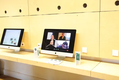
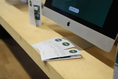
eyesync
Leoni Stein, Enis Sentürk, Philipp Roser
First, we began asking ourselves why eye-contact was not working and why it was necessary for us. Soon we found out that side conversations have a huge impact on the authenticity of meetings.
Why we have no eyecontact during zoom calls
- You see everyone at the same time
- You look at yourself
- You don't know if someone is looking at you
- Every device has a different grid (of people)
- Sometimes the camera is off
Why do we need it?
- For direct feedback
- For inclusion
- For when you need to stay focused
- For emotional connection
- To feel spoken to
- To feel heard
"How might we" questions
- How might we make someone feel listened to?
- How might we show two people that they look at each other?
- How might we solve the problem of having side conversations without disrupting the host?

The technology we want to use is called eye tracking. For this we use an API called webgazer.

re.act
Roman Samarskyy, Sarah Fütterling, Tobias Reinhart

What is this tool for?
re.act is an online meeting tool that enables participants to engage in conversations based on their virtual location within a room. It allows you to express your emotions and reactions to ongoing discussions throughout the call.
Who is this tool for?
The tool is designed for any kind of project group, teaching situations and teams that require simultaneous collaboration.
What type of collaboration is it for (sychroneous/asynchroneous, collaborative/cooperative/participative)?
It is for real-time collaborations.
How does it impact the collaboration?
It makes it easier to connect with other people in the room.
How did we come up with this idea?
The goal of the workshop was to reinvent digital communication and kill a certain aspect of Zoom calls that was particularly annoying to most of us.
We decided to focus on enhancing the ability to express reactions because in a video call, it's challenging to convey your immediate response to something that occurs during the call, unlike in a physical room where others can hear your laughter or comments. We aimed to provide a solution where participants can express their reactions without disrupting the entire call or having them go unnoticed.
We began our project by collecting 'How might we...?' questions and systematically deconstructing them. We started by asking ourselves, 'Why do we want to do this?' and continued to delve deeper by answering the question and subsequently asking ourselves 'Why do we want to do this?' again. Additionally, we explored another perspective by inquiring, 'What's stopping us from doing this?' This approach helped us identify and understand the underlying problems.
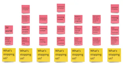

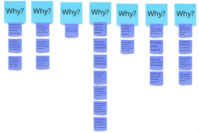
Finally, we were able to summarize our findings in the following questions:
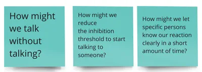
We then conducted competitor analysis by researching other tools that allow users to send reactions.
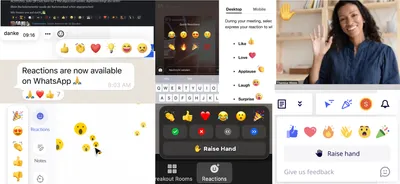
Most of these tools enable users to send emojis as reactions. We then proceeded to analyze numerous emojis, aiming to identify the ones that carry the most universally recognized meanings.
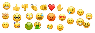
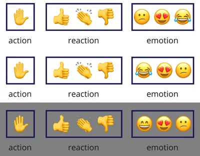
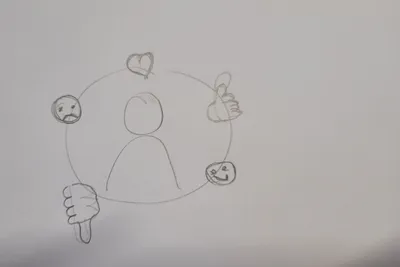
Since most emojis have multiple meanings and can be easily misunderstood, we embarked on a process to determine the most important ones and their specific applications. After extensive discussions, we carefully selected a small set of reaction emojis that we identified as crucial. These emojis are categorized into three groups: action, reaction, and emotion. The final set is visually represented with a grey frame.
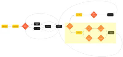
The next step involved creating a concept that could be transformed into a prototype. To achieve this, we developed a flowchart that illustrates the process of sending reactions and provides an overview of how our digital meetings function.
Then we sketched out first ideas of what our interface and reaction process could look like visually.
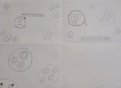
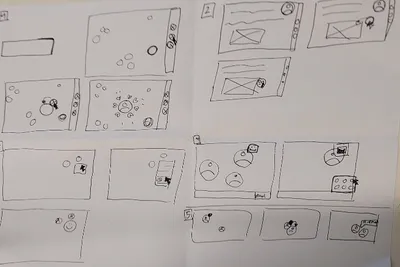
Our result is an online meeting tool that allows you to move freely in the room and therefore to pick a seat and seat neighbors. You can talk to the people you sit close to and hear those further away too but more muted.
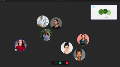
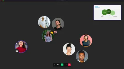
You can send reactions to a specific person, a group of people or the whole room depending on where you drop the emoji after you dragged it out of your selection.
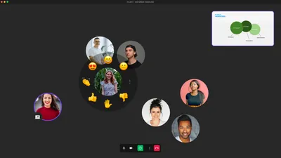
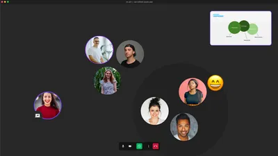
You can receive reactions as well, and like any other tool it allows you to do all that while listening to a presentation or watching a shared screen.
Why is it better than Zoom?
It offers a superior experience compared to Zoom as it closely mirrors the dynamics of an in-person meeting. With numerous opportunities to choose your actions, such as selecting your location in the virtual room and deciding with whom you interact and share your reactions, it provides a more immersive and realistic meeting environment.
What other existing tools could it be compared to and why is it different?
The tool uses all of the basic features that Zoom offers too but has extensions that are connected to the real world. It is similar to the app "wonder" which lets people walk to different places and chose their talking partners as well.