Collaborative Interaction Patterns: HfG's workshop, 21-25 November 2022, Schwäbisch Gmünd (GE)
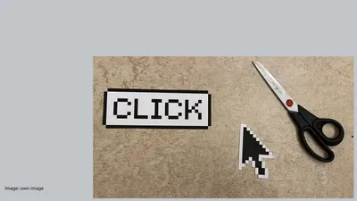
Do the tools we use take on a different form when we create as a group of people on the computer?
Personal computers were originally designed for individual use, with established human-machine interfaces like the mouse or keyboard. These interfaces, represented on the screen as mouse pointers or text cursors, have undergone gradual changes over the past 50 years. However, with the rise of web-based tools, we now have the ability to collaboratively edit documents in real-time with others. Tools such as Figma, Miro, or Google Docs display the presence of team members on the screen, but is this the ultimate culmination of development? What other input patterns could be possible and useful?
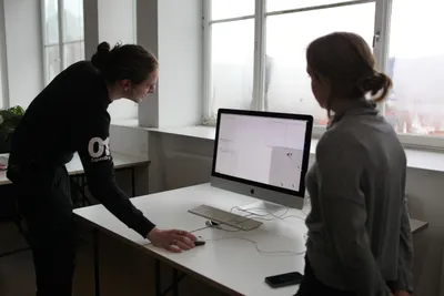
To explore these possibilities, Marc Guntow, an HfG teacher, organized the workshop "Collaborative Interaction Patterns," inviting students to investigate input patterns in team situations and visualize their ideas through prototypes and simulations.
Marc Guntow's Talks
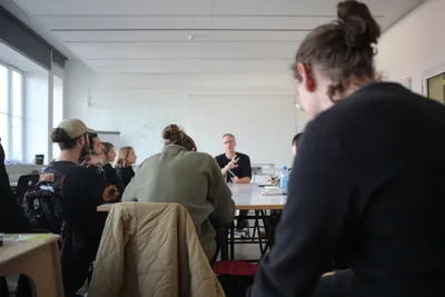
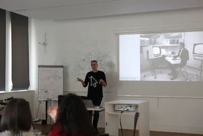
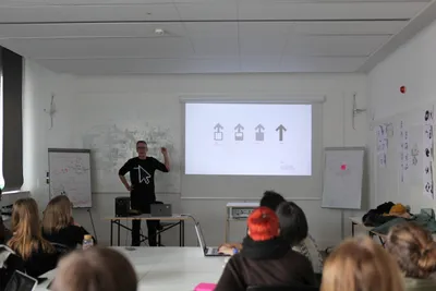
During the first days of the week, each working session started with an introductive talk by Marc Guntow who is leading the workshop.
A Brief History of Mouse Pointers
Mouse and Mouse Pointer have been around for a very long time. Famously they were introduced by Douglas Engelbart in his later so-called Mother of all Demos.
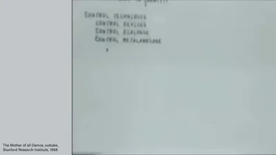
Engelbart performed during the joint Computer Conference of the Association for Computing Machinery and the Institute of Electrical and Electronics Engineers (ACM/IEEE) in San Francisco in 1968.
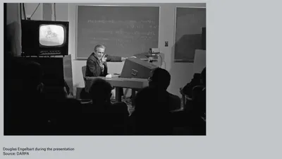
The original title of his conference was A Research Center for Augmenting Human Intellect.
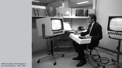
Not only the mouse, but also the desktop metaphor, the videoconference, the conference call, the electronic mail and the hypertext system were displayed to the audience. That was in 1968. Engelbart's presentation was the first to publicly demonstrate all of these elements in a single system. The demonstration was highly influential and spawned similar projects at Xerox PARC in the early 1970s. The underlying concepts and technologies influenced both the Apple Macintosh and Microsoft Windows graphical user interface operating systems in the 1980s and 1990s.
Computers go from text input to graphical input. Therefore, a new input device was needed.
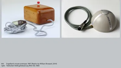
In 1967, Douglas Engelbart registered the patent for the first computer mouse. This early version of the mouse was a simple wooden box with two metal wheels and a single button. Meanwhile, the Rollkugelsteuerung, a similar input device, had been under development since 1965 as part of a contract with German air traffic control to track aircraft positions on radar screens. Although the Rollkugelsteuerung was not utilized for its intended purpose, it was repurposed as a peripheral device for Telefunken's mainframe, which was released in 1969. However, it was quite expensive, costing 5,200 Deutsche Marks (equivalent to 10,300 euros today). Interestingly, the idea of the mouse was published in a Telefunken magazine two months before Engelbart's demonstration. A patent application was made but ultimately rejected due to "insufficient inventiveness.
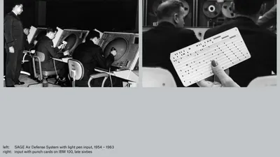
But we do not want to talk about and work on hardware this week... But rather about their graphical representation and behavior.
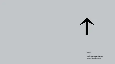
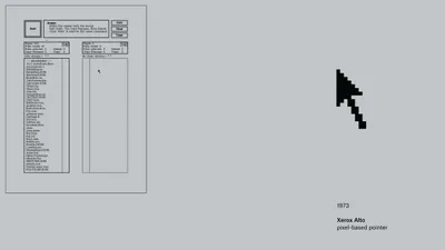
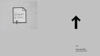
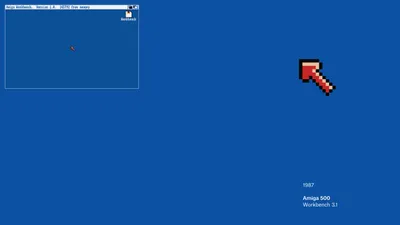
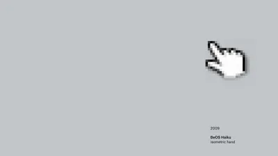
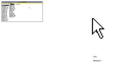
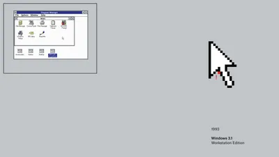
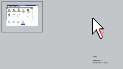
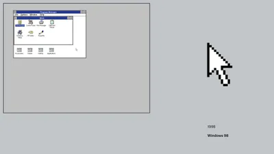
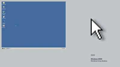
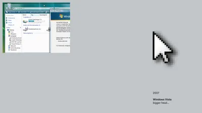
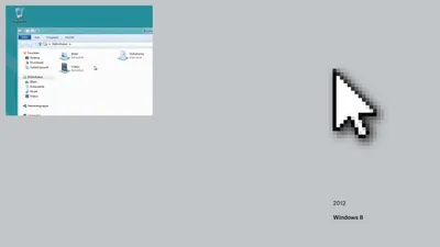
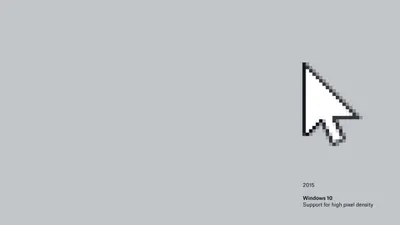
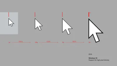
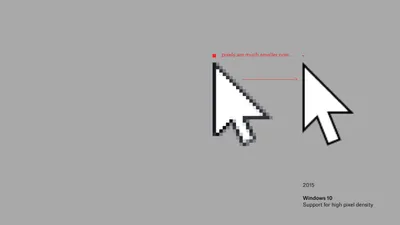
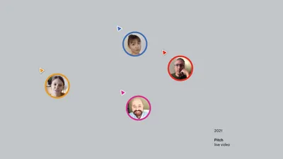
The Evolution of Mouse Pointers Through History
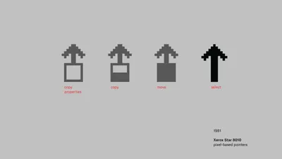
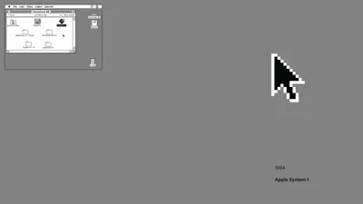
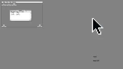
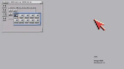

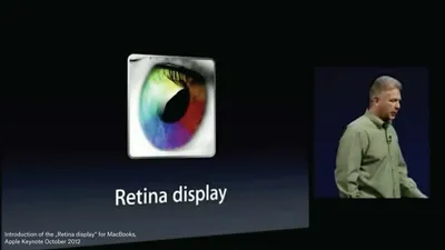
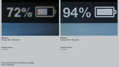
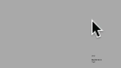
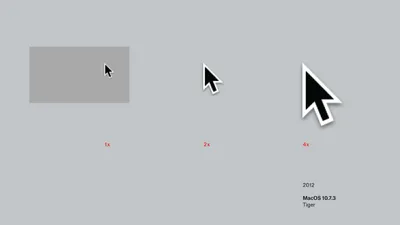

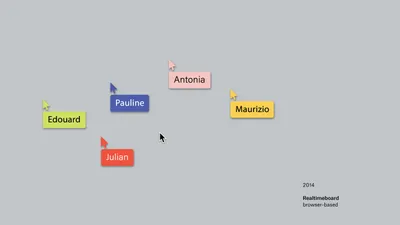
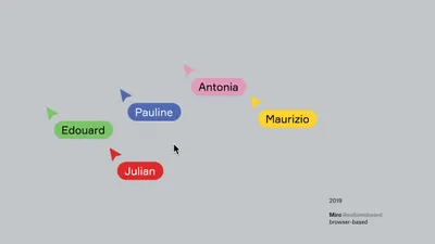

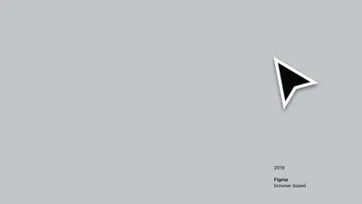
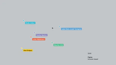

Morphology
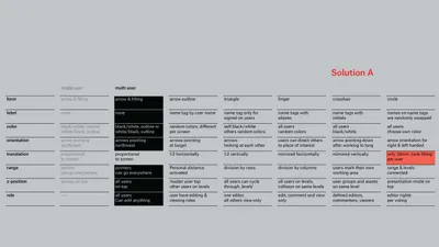
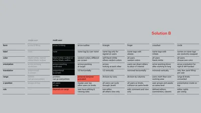
The morphological box is a heuristic creativity technique after the Swiss astrophysicist Fritz Zwicky (1898-1974). For a given question, determining parameters are defined and noted vertically. Then possible expression for each parameter is noted horizontally. This creates a matrix which displays all possible solutions. Then for each parameter one expression is selected, resulting in a combination of expressions -- one single solution.
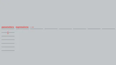

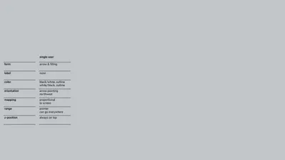
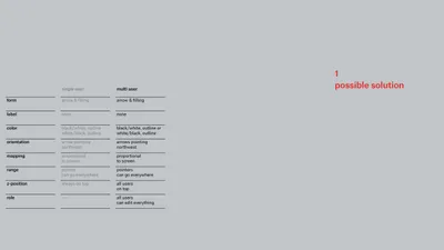
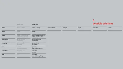
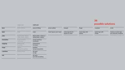
The solution space gets exponentially bigger with an increasing number of parameters.
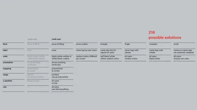
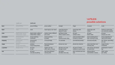
This is a first solution generated by our morphology. Thus, a morphology can be seen as an algorithm generating possible solutions in our solution space.

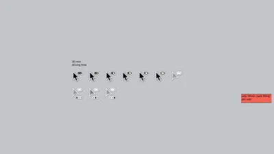
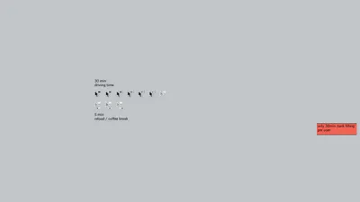
Some attributes can be interdependent.
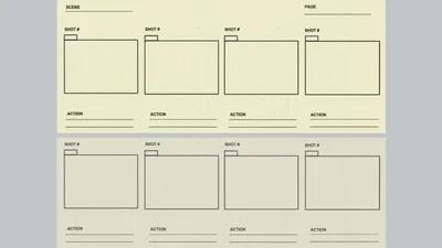
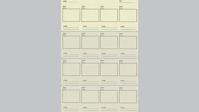
Storyboards
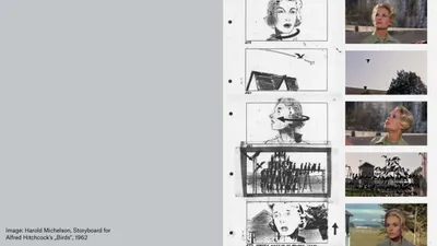
Storyboards are used to visualize screenplays and plan individual film scenes with sketch-like representations before shooting begins. The finished screenplay is translated into images for the first time in the storyboard and enriched with the concrete design such as perspective, viewing angle and size of settings.
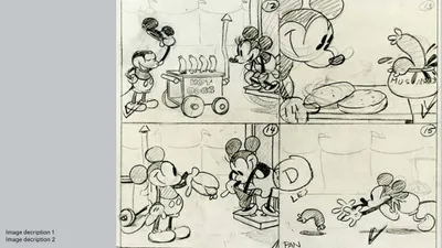
The invention and use of storyboards dates back to Disney Studios. The storyboard is related to the comic strip in terms of structure and use as a visualization of narratives.
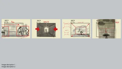
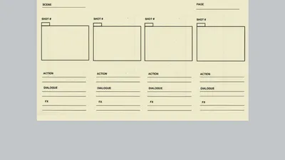
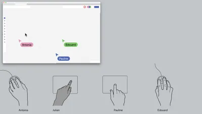
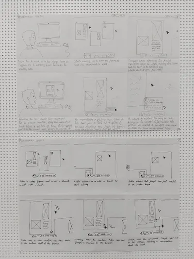
If we draw out storyboards for collaborative situations, we will have to look at each user's perspective separately.
Antonia is using a web-based application.
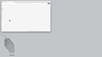
Together with three other users. Those users are identifiable (by color, name tag, etc.)
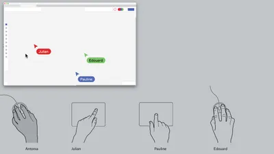
Notice: Julian has a different view. His cursor is now the system cursor.
And so on for Pauline…
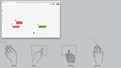
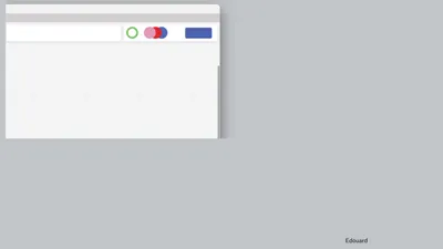
There is also a convention of minimized status displays for present users.
Interface, Action, Man-Machine-System
What is an interface?
What is an interface?
- Not a thing
- Not touchable
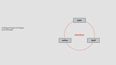
- A relationship between user, tool and action
- The relationship of a user who, with the help of a tool (a hammer, a computer or a bank card), performs an action (hammer in a nail, create a drawing, manage money).
"Design is the domain in which the interaction between user and product is structured to enable effective actions" (Bonsiepe, 1996).
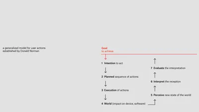
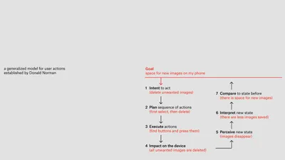
Seven stages of action
Seven stages of action are a generalized model for user actions established by Donald Norman.
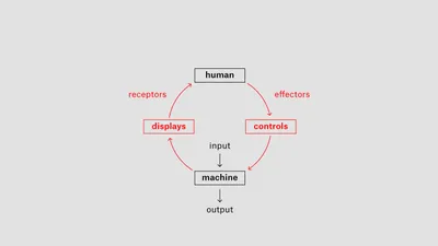
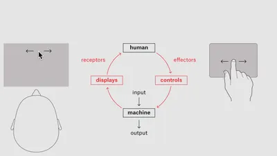
Man-Machine-System or (hu)man-machine-sytem
A human-machine-system is the relationship between processes in a system that describes human activities to solve tasks with machines.
Prototypes
Visual Prototype
A simulation that should come as close as possible to the desired result. In our case, a click-dummy, a slide presentation or a video that visualizes your ideas.
You could use Keynote Magic Move -- you have just seen this or the respective PowerPoint Morph Transition to create simple animated clips that display mouse pointer actions. More sophisticated animations can be done with Adobe After Effects or clickable prototypes with Figma (and smart animate).
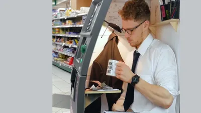
Wizard of Oz Prototype
The name is taken from the 1939 musical fantasy film starring Judy Garland as the girl Dorothy from Kansas. Dorothy finds herself in the fantasy land of Oz and the only person powerful enough to bring her back home is the mighty wizard. At the end of the movie the wizard is revealed to be just an ordinary man, operating machinery that projects his ghostly image.
So, "Wizard of Oz" means that the technology is not here yet, but the experience is created through a clever deception -- everything is operated manually in the background.
Proof of Concept Prototype
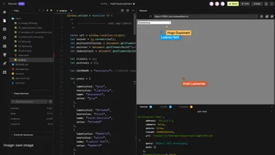
This is the opposite concept to a Wizard-of-Oz-Prototype. The main technical part works and can be evaluated, but visually everything is still rough or not yet designed.
Teamwork
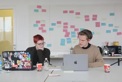
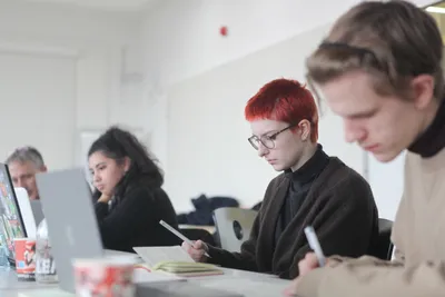
The teams were formed during the first day, according to affinities between students and teamwork began immediately, in order to prepare Friday's presentation. Marc Guntow's talks listed below, introduced each step of the work.
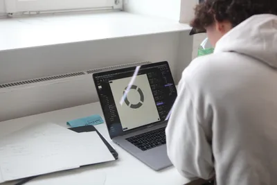
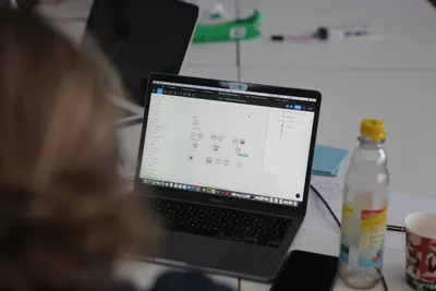
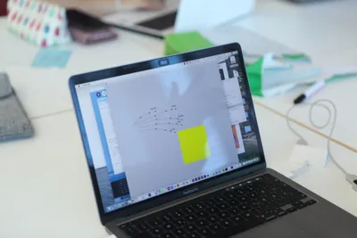
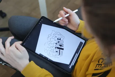
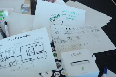
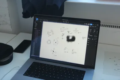
Projects made by students
Authentic Emotion Capture in Digital Collaborative Working Spaces
Andy Parker, Nicole Krein, Kaisa Uik
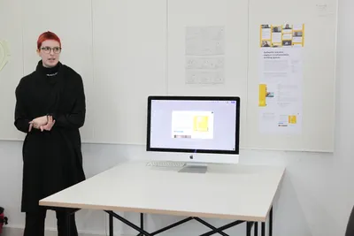
What is this tool for?
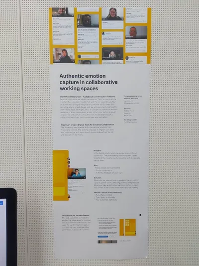
In the digital collaboration era people tend to lack emotional connection in the workspace. They are working with computers rather the people using them. This tool makes it easier for co-workers to create emotional connections, it helps start conversations both about work and personal life and it lets you see authentic feedback of your work.
How does it work?
When you are viewing your co-worker's frame, motion capture system starts detecting your facial expressions. When you have a distinctive reaction, a picture is taken of you and posted in the frames corner. You can add a comment to explain your reaction or make a face with a stronger emotion to change it. You cannot delete your own reaction, but others can.
What did we make?
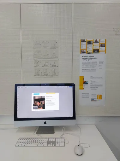
Within four days we made a Figma file with different components that could be added to Miro or Figjam. We also recorded a video with three scenarios of the ways the tool could be used after drawing storyboards. In the end we made an explaining poster with pictures of scenarios.
What type of collaboration is it for (sychroneous/asynchroneous, collaborative/cooperative/participative)?
This is made as a new feature for digital collaboration tools like Miro and FigJam.
How does it impact the collaboration?
Digital collaboration is often very serious, and it lacks emotional connection. With our solution people would give insight into their mood and working spaces. By making the workspace more intimate by creating an emotional connection between people. It also makes it less formal and more fun so people would feel less anxious and alone while working from distance.
How did we come up with this idea?
At first, we came up with a few ideas which would be interesting to work with concerning digital collaboration and cursor qualities. We thought about gamification, making the workspace less formal and more connecting. We then defined the problem we see in digital workspaces -- that people lack emotional connection that they usually have because they see face to face. We then started brainstorming about different ideas and stuck with the one where a picture is taken of you automatically to ensure authenticity.
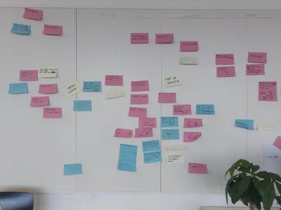
What other existing tools could it be compared to and why is it different?
The solution can be compared to the stickers feature because they also show what the other person is feeling. However, with our solution, the reactions are real and authentic, they cannot be faked. In contrast, while using the stickers, one can choose any reaction, even if they don't feel genuinely that way. Seeing people's faces also makes you more familiar with them, creating a more comfortable working environment.
FaceCursor
Vadim Drobot, Julien Dzviga, Hugo Guyomard
What is this tool for?
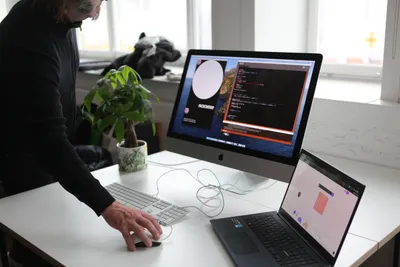
FaceCursor is a short program that comes with a simulation of an interface, incorporating a webcam into the mouse clicker. This tool has the potential to reinvent the concept of video content by introducing live elements, for example. Furthermore, it could serve as an add-on to integrate into our operating systems, allowing us to move away from simple video chat software and embrace a hybrid solution between TeamViewer and Facetime (or the good old Skype).
What type of collaboration is it for (sychroneous/asynchroneous, collaborative/cooperative/participative)?
This tool is clearly designed for synchronous collaboration, distinct from a simple "emoji" or "thumbs up" discussion. It has the potential to be cooperative as well, with the inclusion of additional features such as drag-and-drop or clipboard actions that involve simultaneous user clicking. Currently, users have the ability to draw directly on their "mouseelf," extending the functionality of a paint program to include live webcam capabilities.
How does it impact the collaboration?
FaceCursor clearly doesn't claim to be a huge innovation, but rather a "cool" blending of several existing tools brought together.
How did we come up with this idea?
The inspiration for this project came from our frequent use of Snap or Instagram filters, but also with this ability to move your face anywhere on the screen, when you are in a Facetime or Messenger call on a smartphone (or similar device).
What other existing tools could it be compared to and why is it different?
The difference with well-known tools like Miro or Figma is the addition of the mouse pointer with an integrated live camera and the ability to have a "real human" interaction with it.
Autonomous mouse pointer
Nicole Krein, Héloïse Debrand, Ludovic Hohl
What if your mouse pointers were retired?
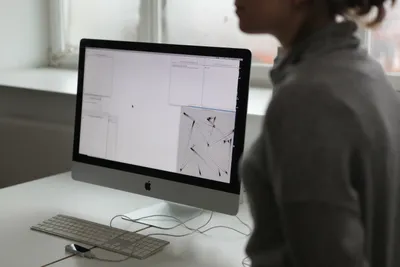
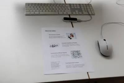
Thanks to the Leap Motion Controller, there is no longer a need for mice or even mouse pointers, so they are now retired and living their best life as autonomous pointers. Let's see what this one is busy doing in the background.
Conclusion and openings
This week was productive in terms of discussions, experiences, and design. Students modeled numerous tools and explored a wide variety of intentions that aim to discover new ways of interacting with each other. We witnessed moments of skills and tool sharing among team members, which was particularly interesting as it blurred the boundaries between our school's pedagogies. The exchange between students allowed for a porous integration of different educational approaches.
During this third and final workshop week, the teachers also had the opportunity to discuss how to showcase all the work that had been done. We considered different formats for disseminating the work and ultimately decided on an exhibition in each school, with similar content. This would involve video interviews with the students who participated in the workshops, all answering the same set of questions that we collectively wrote. Throughout the workshop, we received informal feedback from the students, as they were the ones most directly involved in the collaborative work. Recognizing the importance of their perspectives and experiences, we felt it was essential to give their testimonies and reflections on the subject of digital collaboration a prominent place.